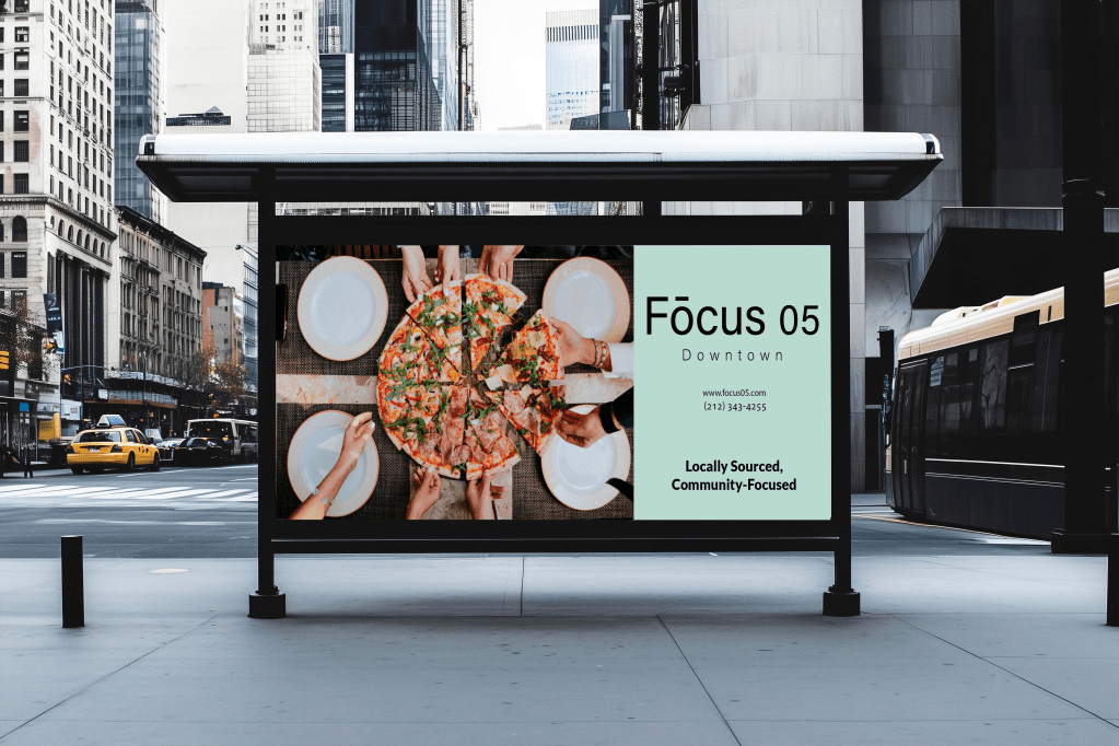
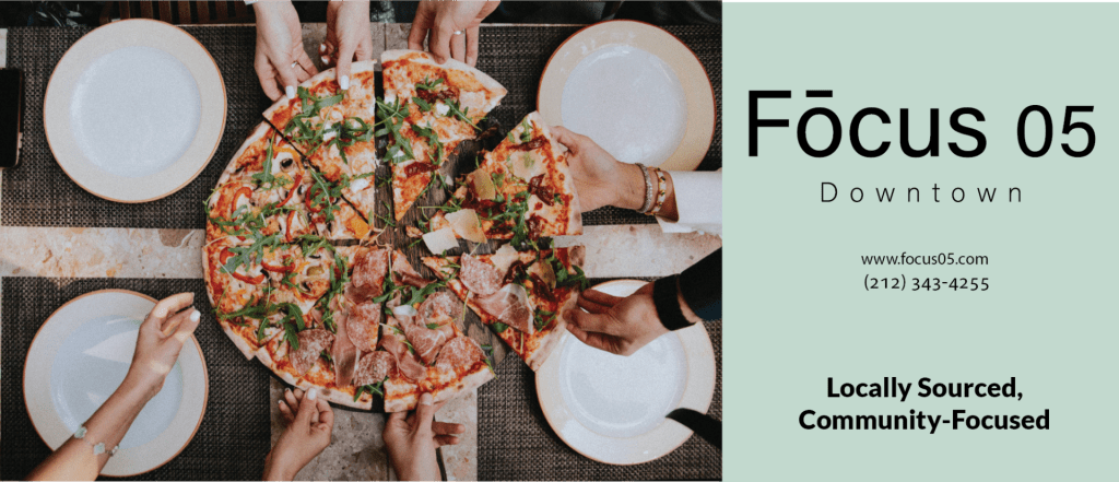
For this design artifact, I created a large advertisement for a restaurant named Fōcus 05. The audience for this design was the millennial generation who are drawn towards new and memorable restaurants where they can embrace connection to community, nature, and technology. In order for this design artifact to be effective, it was important to include imagery that was unique, interactive and socially engaging. It was also essential to include the values of this restaurant, such as their food being locally sourced and how they commit to community.

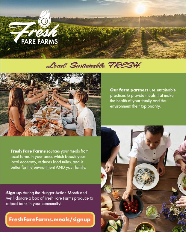
For this design artifact my role was to create an article for the company Fresh Fare Farms. I included imagery that reflected racial and ethnic diversity with a warm, friendly, authentic feel while showcasing moments of how the food is grown as well as imagery that captured genuine expressions and moments of a diverse group of people enjoying a meal. I also ensured to include the company’s brand colors, typography, and the tagline that is, “Local. Sustainable. FRESH.” to summarize Fresh Fare Farm’s values.
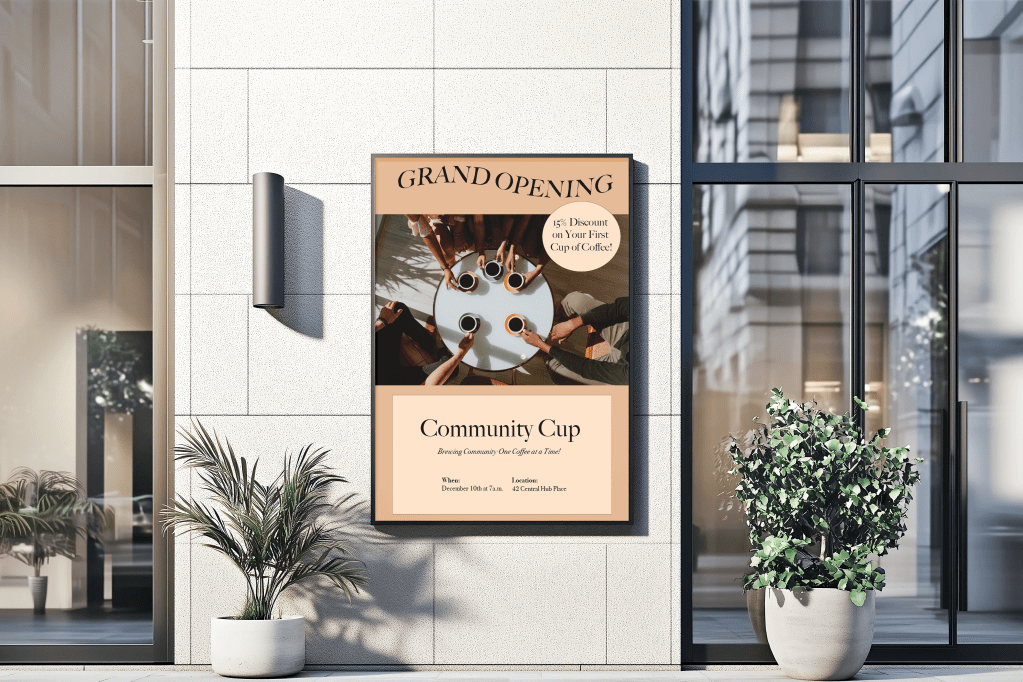
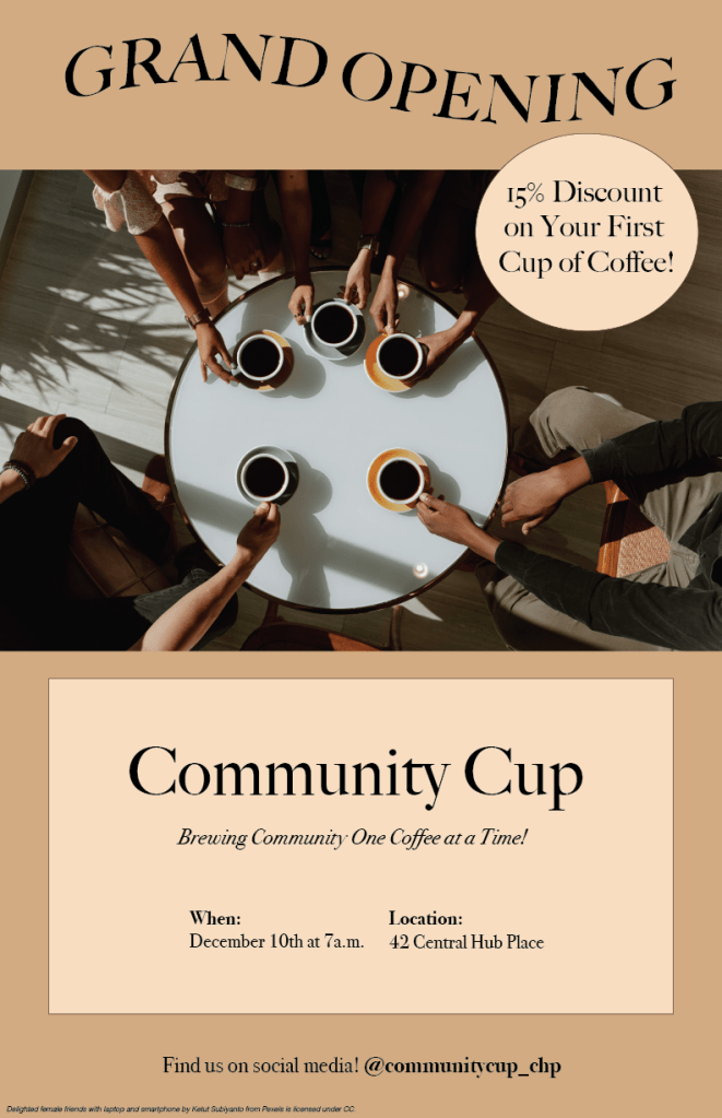
For this poster ad, I chose a color palette that uses warmer colors with brown and cream colored tones which reflects the coffee colors. The typography uses a simple, elegant, legible typeface which reflects the cleanliness of a coffee shop. The typography of “grand opening” in a wave pattern makes a point of an announcement to the viewer. The organization brings a clean, elegant look which resembles a coffee shop environment. The image of friendship brings a sense of community while enjoying a cup of coffee, which is the direct message of this company.
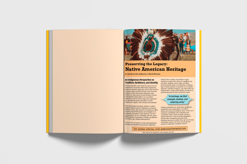
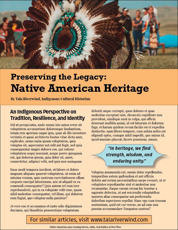
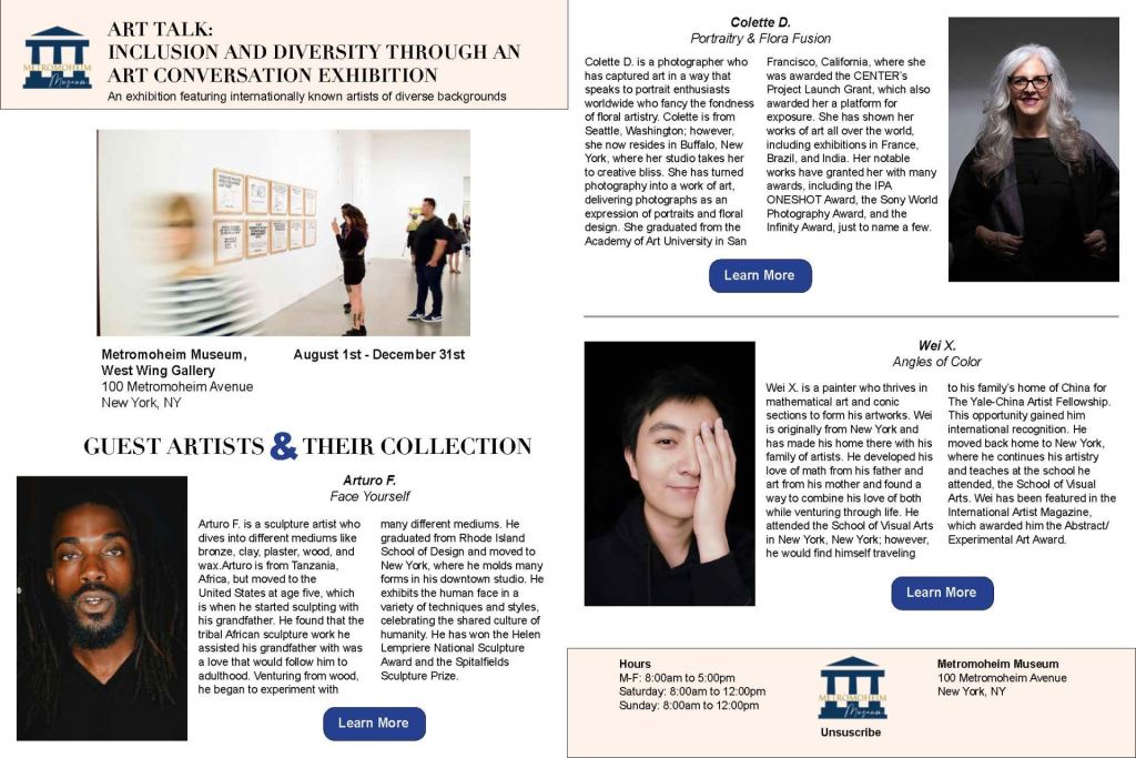
My role in this design artifact was to create a magazine article with colors that would respect and reflect the Native American culture and embrace the bright, bold color palettes the target audience would prefer. I chose to place the pull quote in a unique shape to welcome diversity and the arts as the target audience prefers. In order to ensure the contrast was efficient, I checked the color codes through WebAIM color contrast checker that met approval.
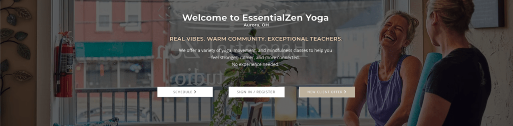
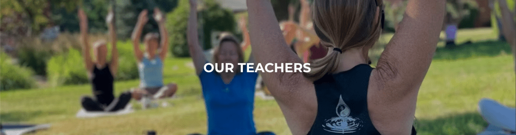
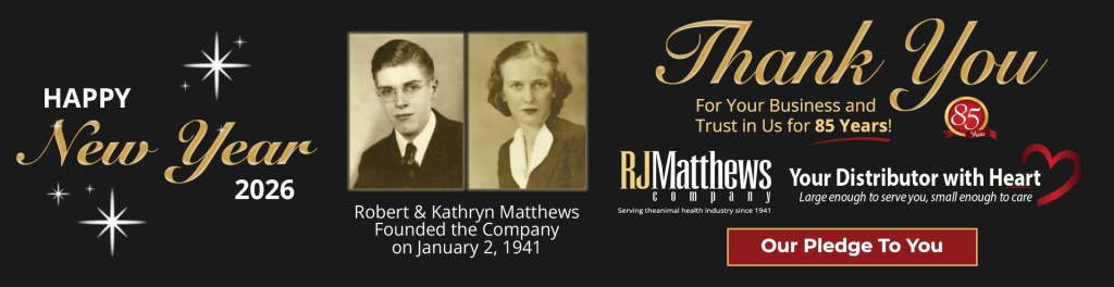
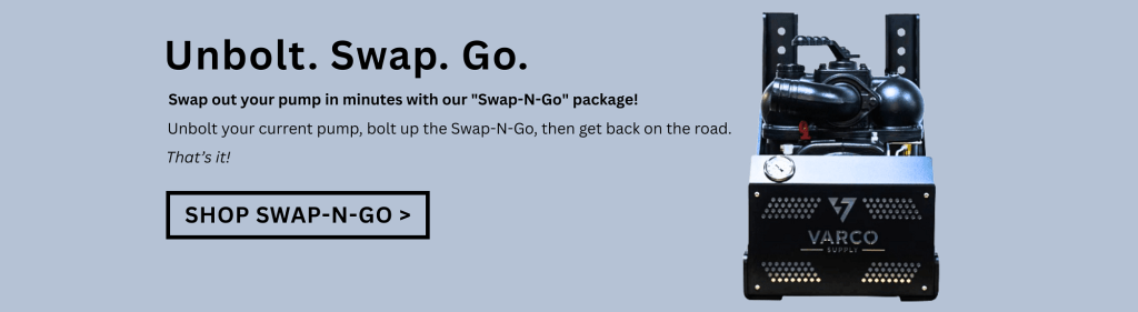
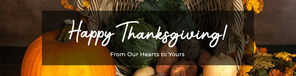
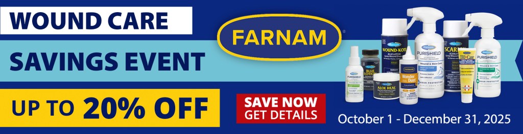
Website Banners
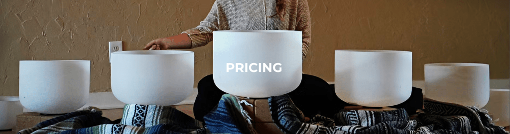
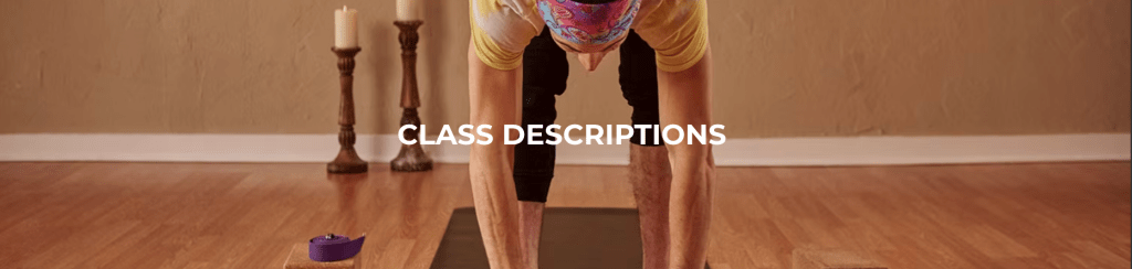
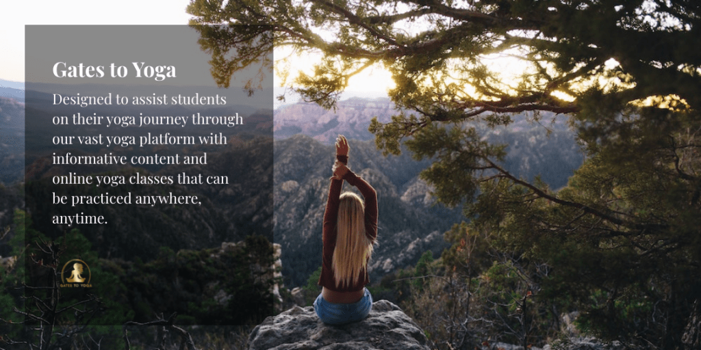
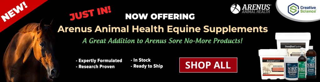
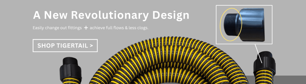
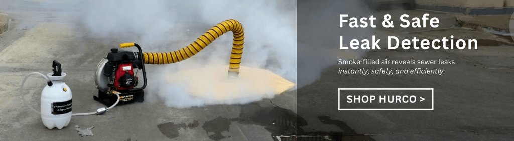
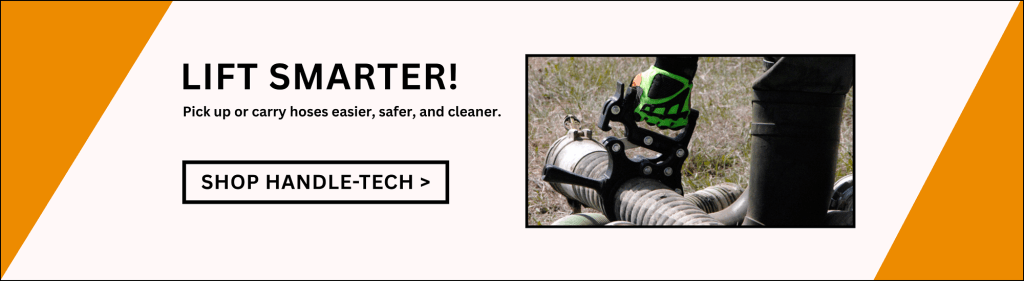
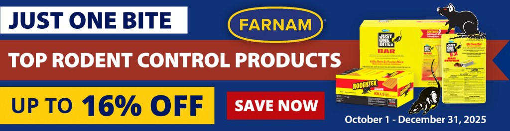
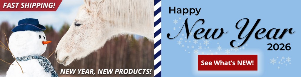
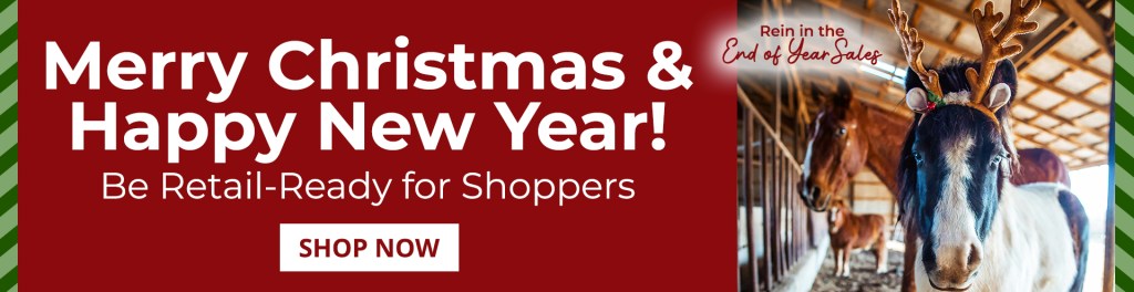
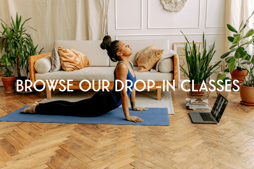
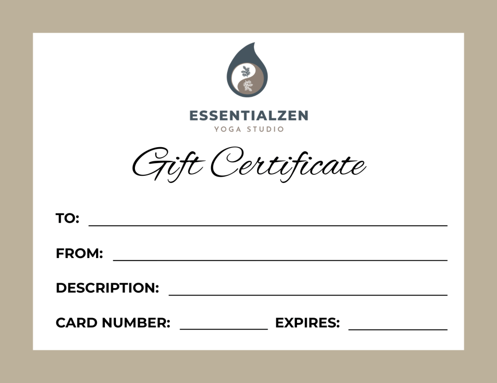
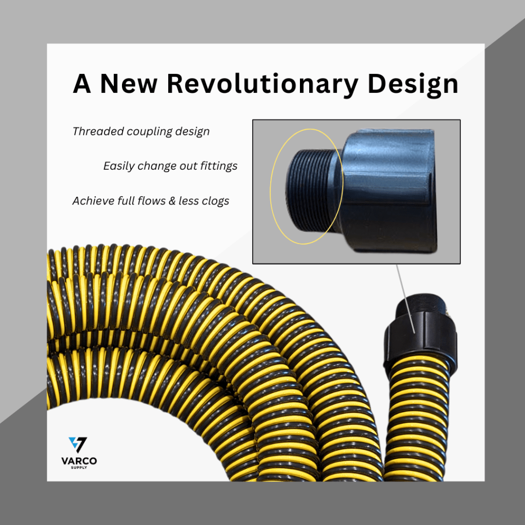
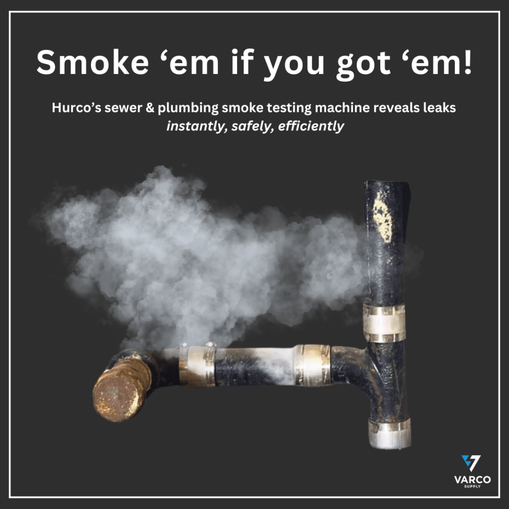
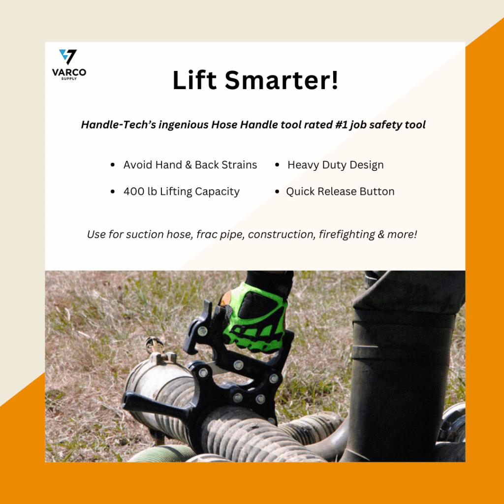
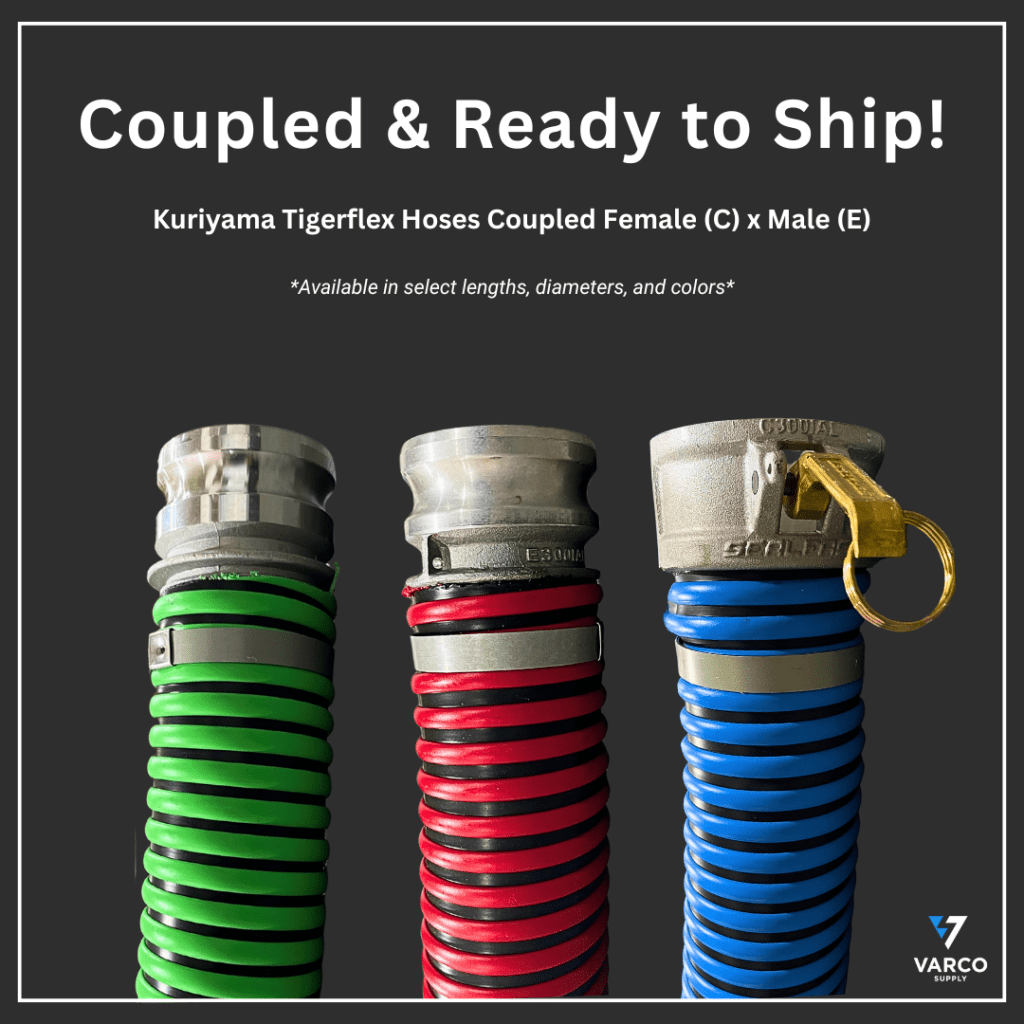
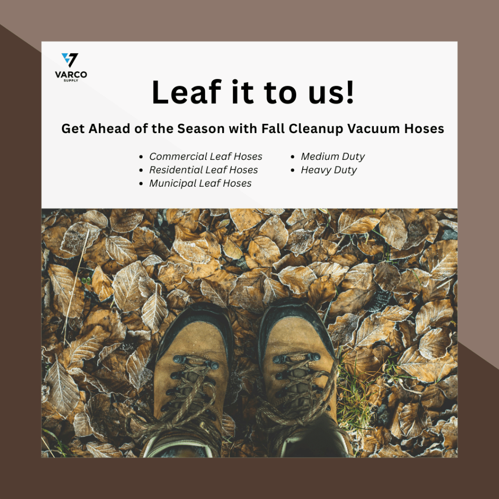
Banners created for EssentialZen Yoga, PBS Animal Health, Varco Supply, and Gates To Yoga according to brand guidelines.


Email Marketing Campaigns PDFs

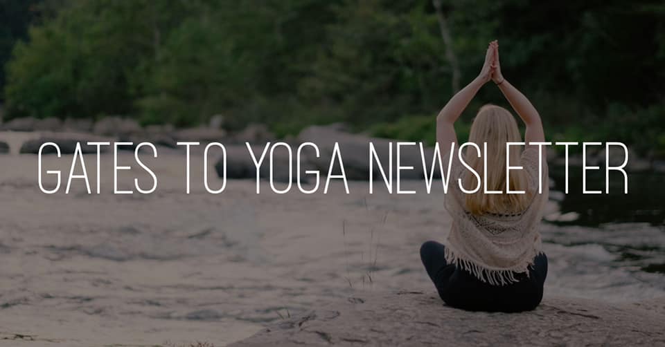
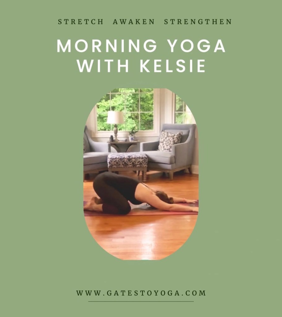
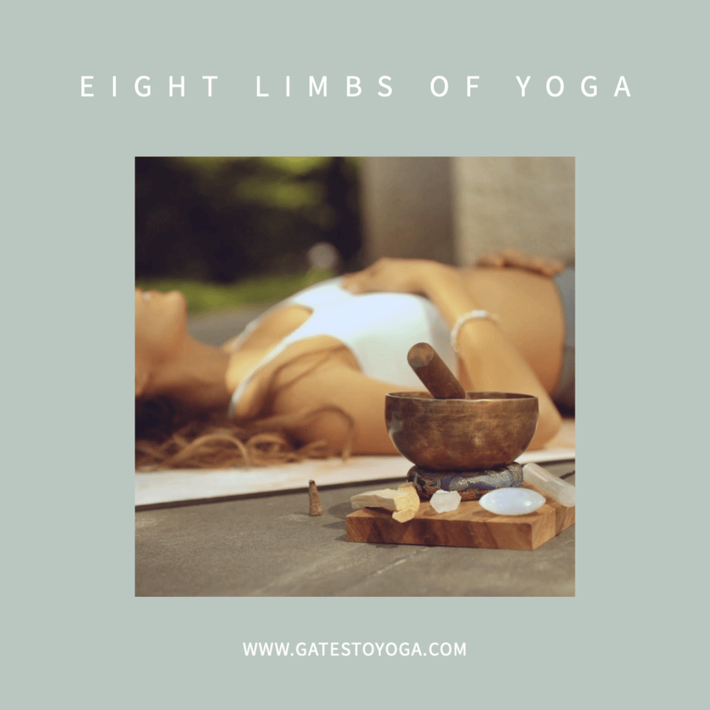
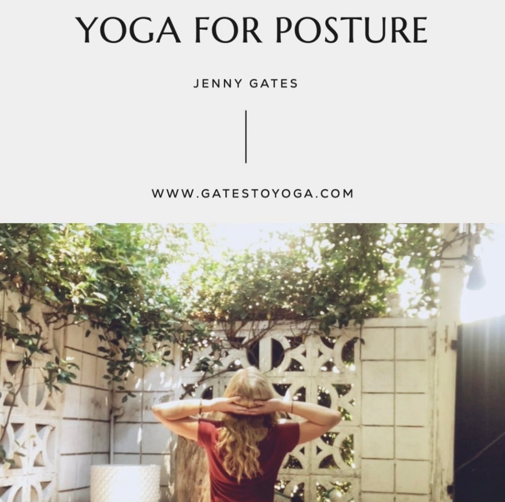
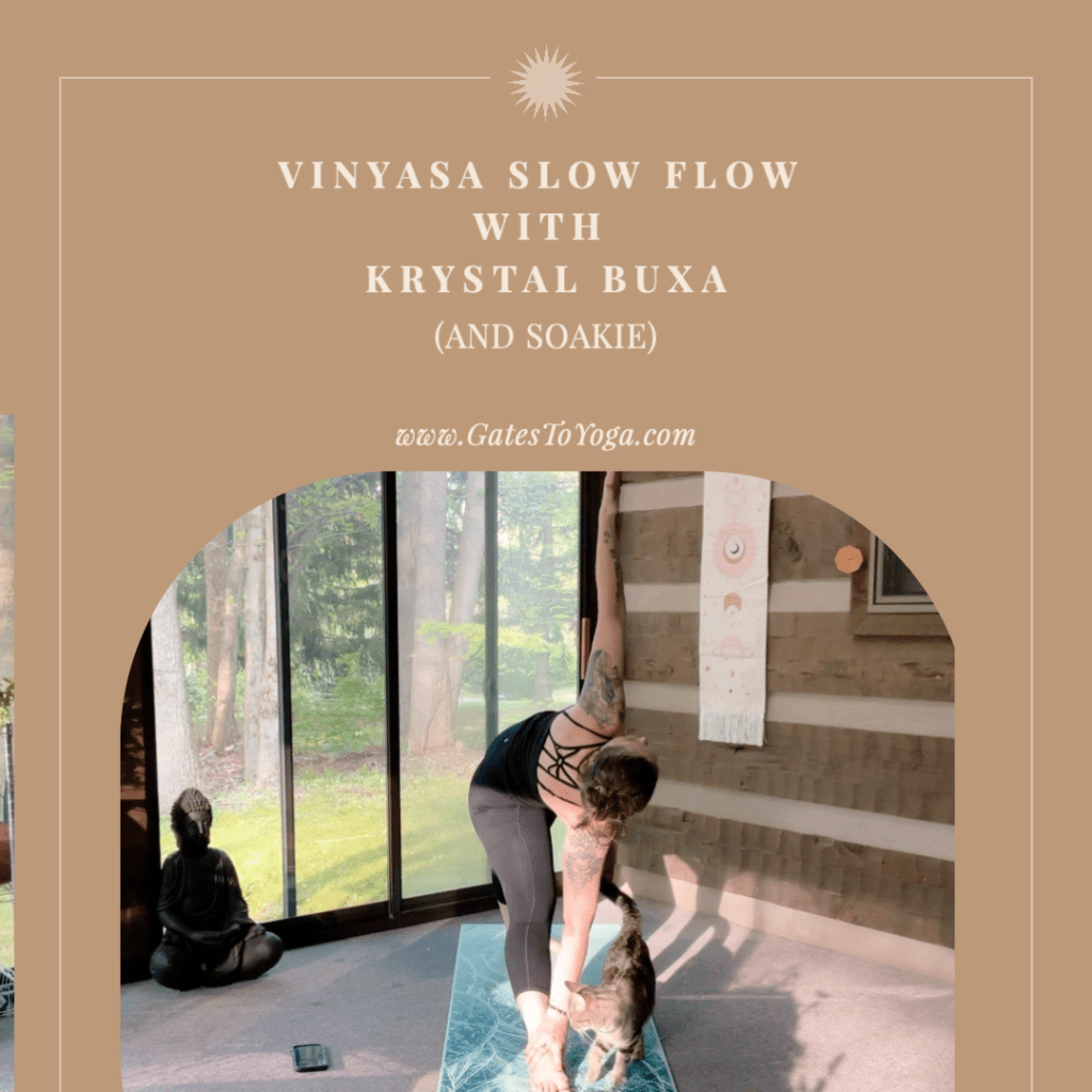
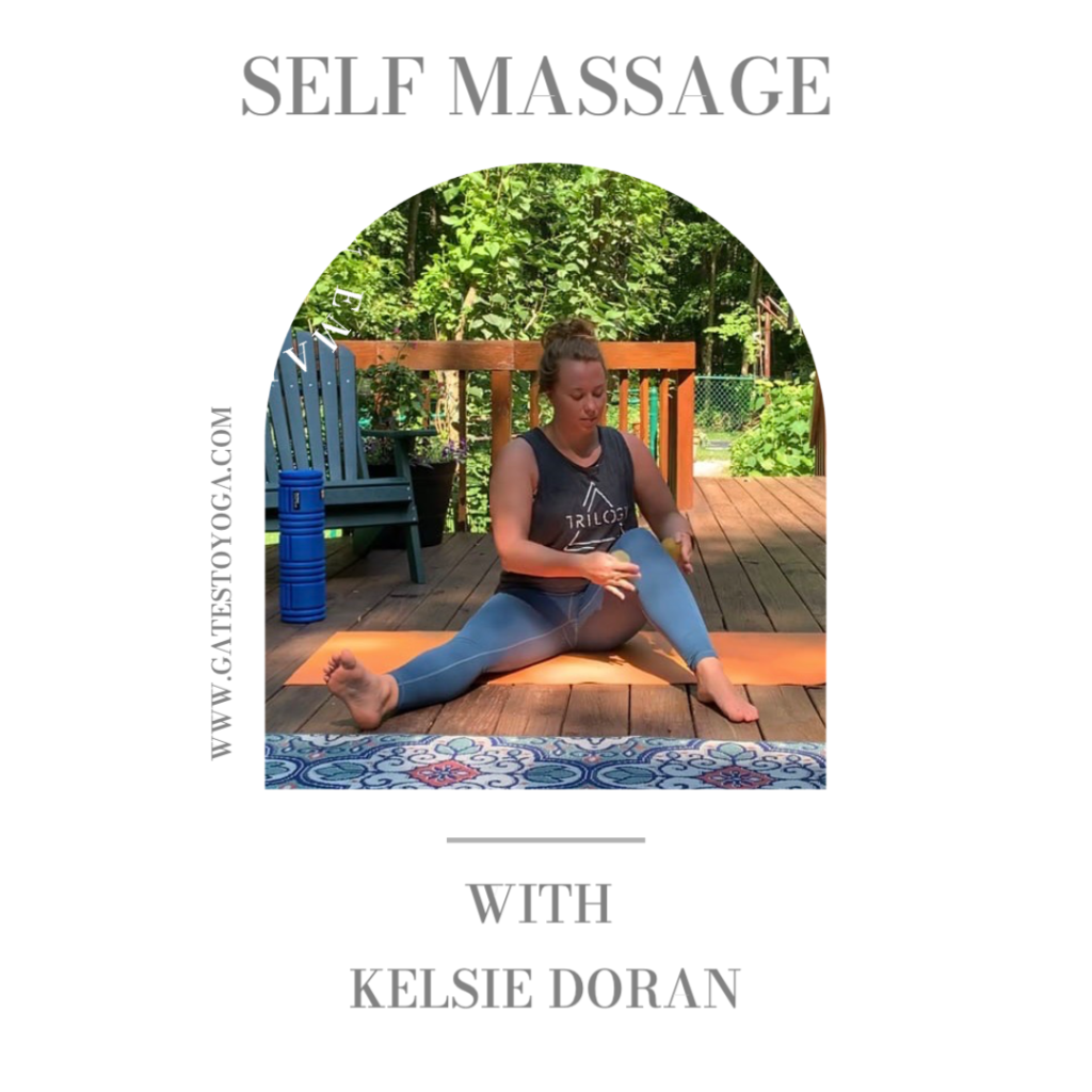
Gates To Yoga Emails (from when I operated my own yoga business)

Earlier Projects & Social Media Posts


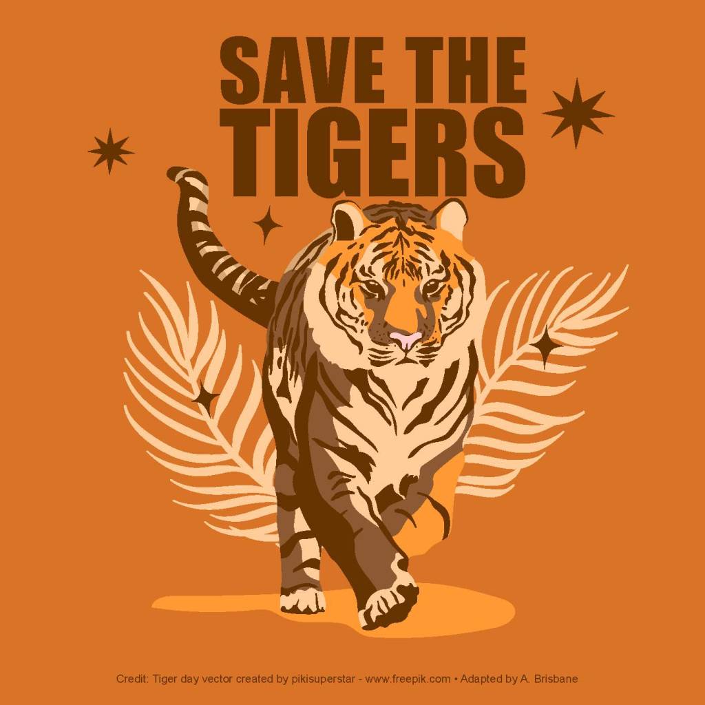
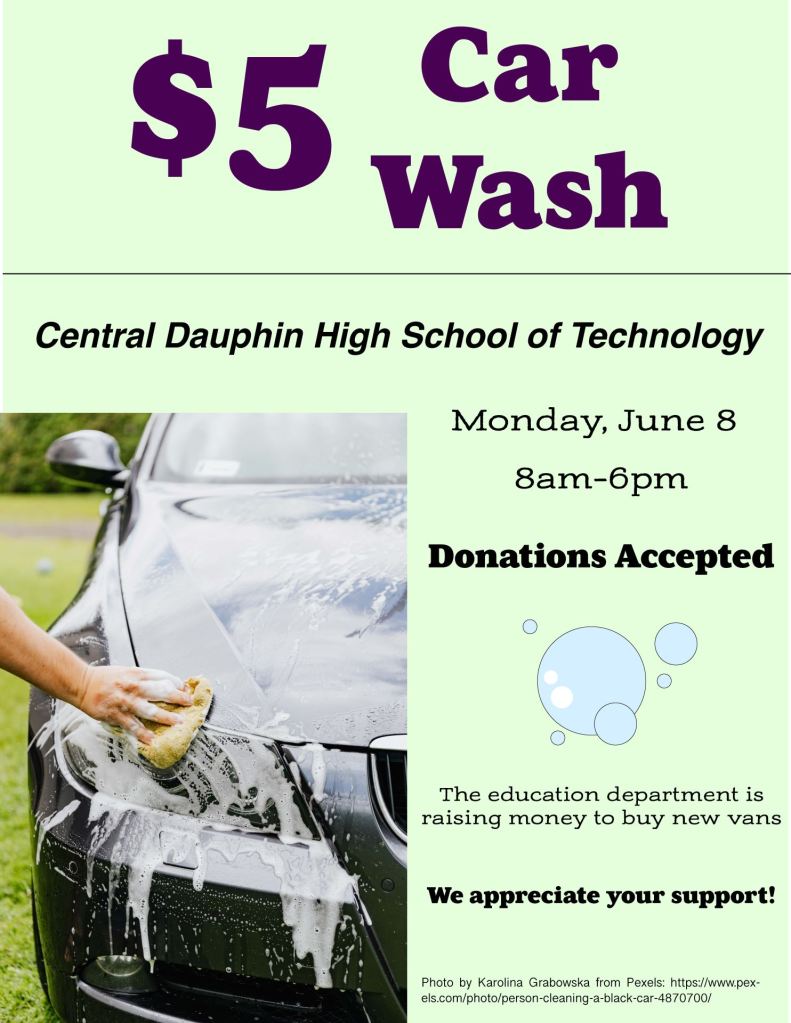
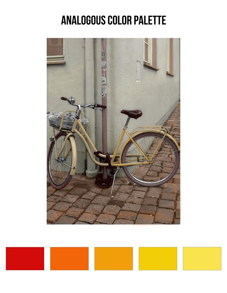
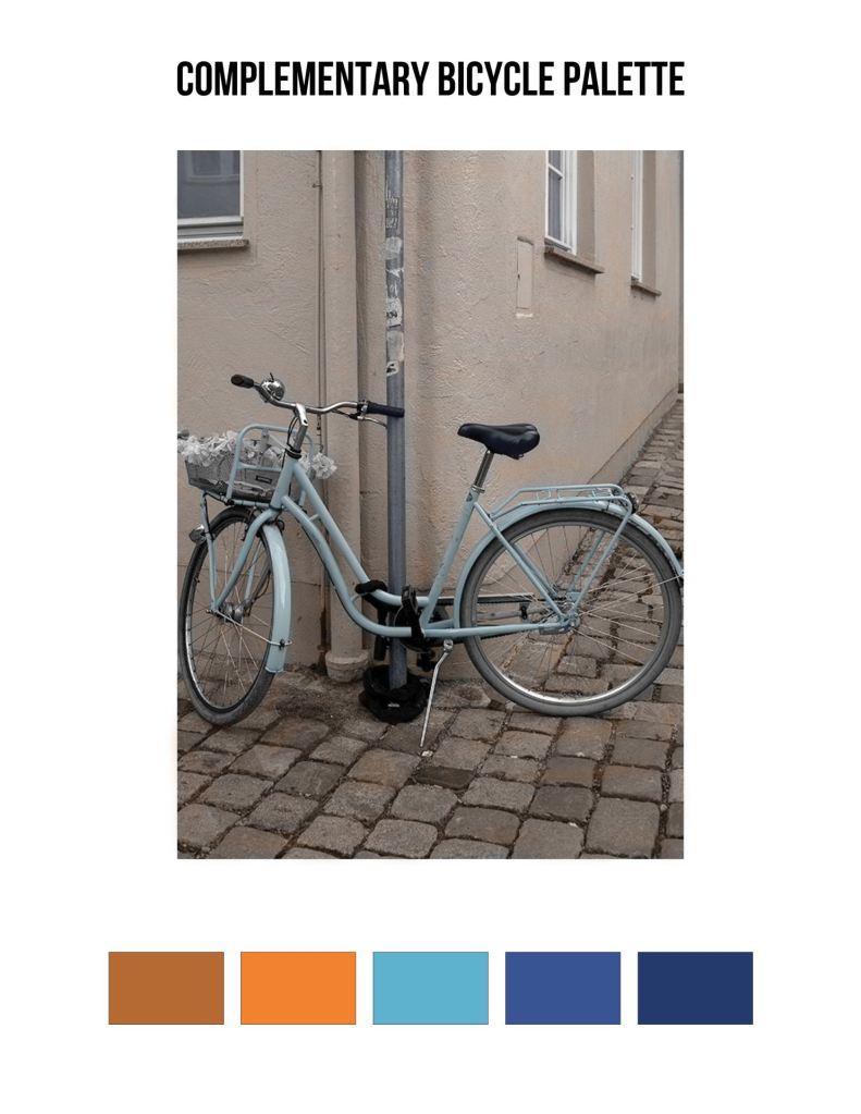
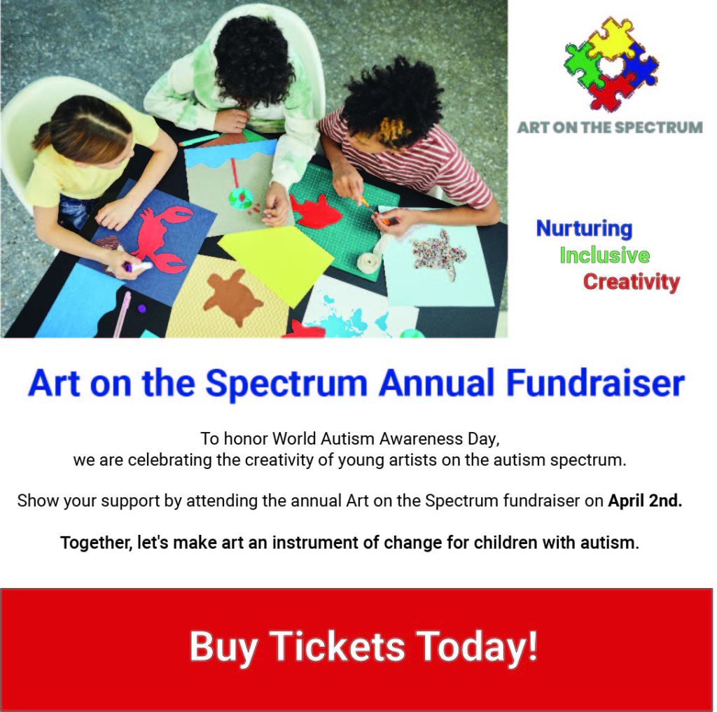
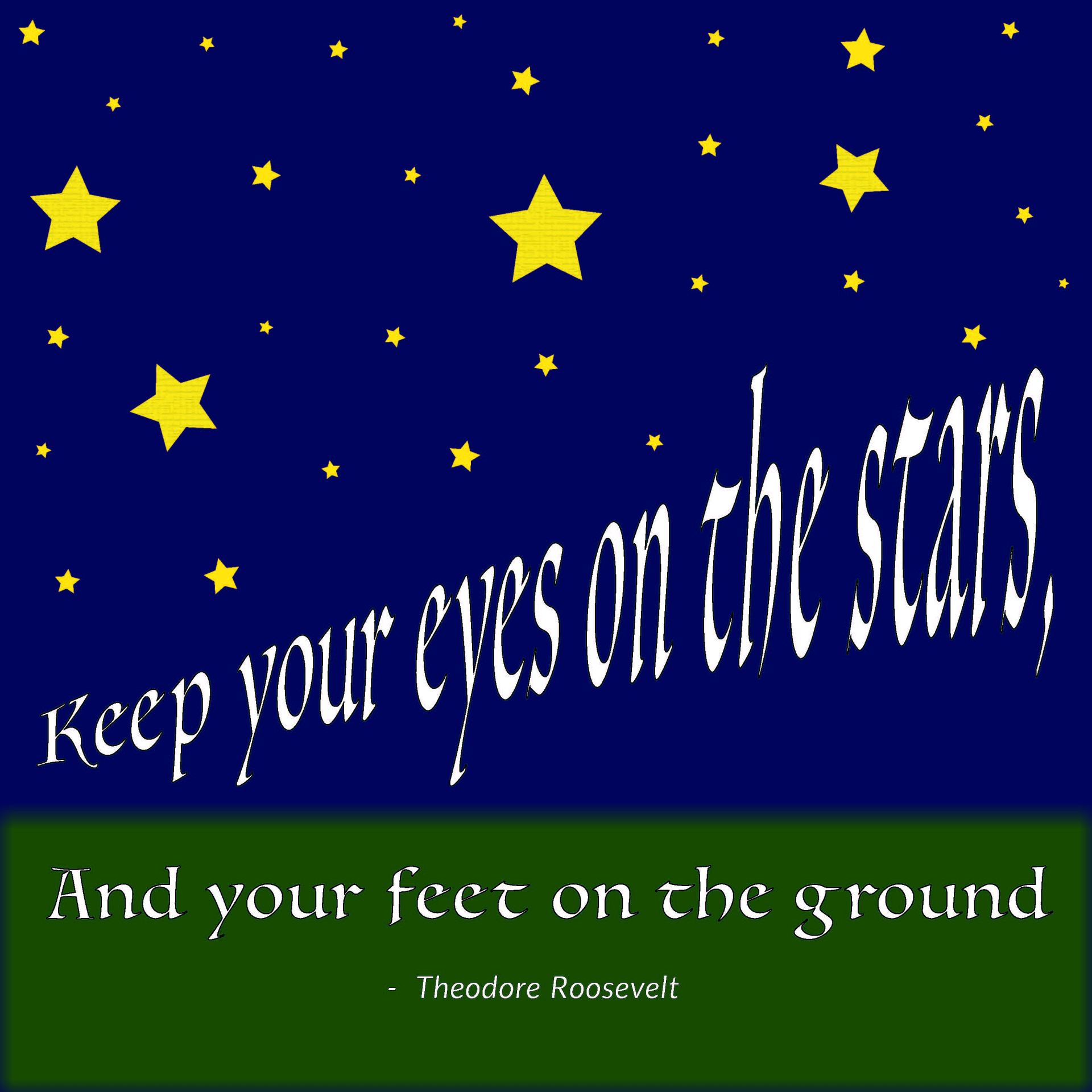
Projects for Classes at SNHU