Bowlsome Smoothie is a growing smoothie brand that focuses on offering healthy, customizable smoothie bowls. They wanted to enhance their customer experience by introducing a self-service smoothie bowl ordering kiosk, allowing their customers to customize their smoothie bowls without waiting in line for counter service.
My role in this design project included assessing the client brief provided from the company, creating design systems for low fidelity and high fidelity wireframes, completing user testing and user research, and high fidelity prototypes.
Areas that needed addressed included navigation, iconography, larger text size and minimum interactions for accessibility, incorporating additional colors into the company’s color palette with neutral and semantic colors, creation of design components and form fields.
Design Journey

User Persona
When designing this prototype, I looked at the Client Brief of Bowlsome Smoothie that provided information about the company, their goals, market research, user personas, and brand colors. This allowed me to better understand the company and who they seek to appeal to through the market research and user personas. The Client Brief encouraged me to consider the client’s accessibility, such as, keeping the interactions to tasks kept to a minimum in order to save time as well as using sufficient color contrast for optimal readability. Another consideration was for users accessing the kiosk while in a wheelchair and ensuring that they are able to interact with the product with ease.

Low Fidelity Wireframes
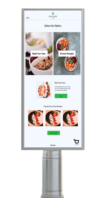
Low fidelity wireframes were created while keeping in consideration the specifications made by the client within their Client Brief, which were dimensions of 17” by 24”. Based on the market research provided, I focused the design on being convenience-driven with the ability to build their own smoothie from scratch, as well as saving time through already-created recipes to choose from by Bowlsome Smoothie.

Design System Form Fields
Since the company was still building their brand identity, I also created a design system to present to the client so they have a better understanding of the best way to present design elements such as CTA buttons and their colors (default state, hover state, toggle state) as well as typography and form fields.
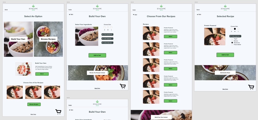
High Fidelity Wireframes
After approval in the low fidelity wireframes and design system, the design was then turned into high fidelity with the company’s brand identity and goals included through the self serving kiosk. The high fidelity wireframes were then turned into a prototype and presented to users for user testing.
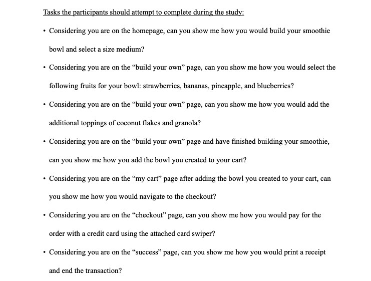
User Testing Script Tasks
The high fidelity prototype for the self servicing Bowlsome Smoothe Kiosk was presented to users for user testing. When looking at the results of the usability test study, there were a few strengths the prototype contained. The navigation seems to be clear and straightforward for users, they are able to find the button to carry them over to the next page or step in the task. A challenge or area of improvement based on the usability results would be including more interactivity within the prototype, such as the text next to the drop down arrows. Both of the participants had the same feedback in this aspect, expressing more interactivity instead of just the arrows. By adding more of this, it could help eliminate confusion or frustration, especially if they feel the arrow is too small to select.

Final Design of Build Your Own Page
The feedback from the user testing was taken into consideration and addressed within the all pages of the design in order to improve the usability for a more seamless user experience. View the live prototype by clicking below!
Overall What I Learned…
This project taught me the importance of assisting a company with their brand identity to create a stronger, consistent look across all pages of their prototype. I also learned and embraced the importance of considering all users within a design, such as those who may be in wheelchairs and need to access the self serving kiosk from a lower viewpoint as opposed to someone standing with a raised view. Completing user testing opened my perspective to potential problems others may experience while using my design that I may have overlooked. Hearing their input showed me ways to grow, change, and increase my expertise as a designer.
