
FutureFunds Financial Planning is a company founded in the early 2000s with a singular mission: to empower and guide young professionals in achieving financial success and security. Their company is committed to helping the next generation make informed financial decisions that will shape their future.
My role in this project was to improve the design created by a junior designer within Adobe XD based on the results and feedback from the user testing that was completed. In order to be effective, this design needed to include requested features by the company such as service offerings, financial calculator, appointment scheduling, recent blog posts, and testimonials. The company provided their logo and their primary and secondary colors, which also needed to be included for their brand identity.
Incorporating the user feedback was necessary to make improvements to the already-existing wireframe. The users found placements of the design elements confusing, such as the appointment scheduler being placed at the top and the placement of reviews in the middle without an introduction into who the company is and what they offer. They also felt there was a lack of labeling sections or forums and found the navigation overall confusing with an overload of information. These areas were needed to be addressed within the design process.
Design Journey

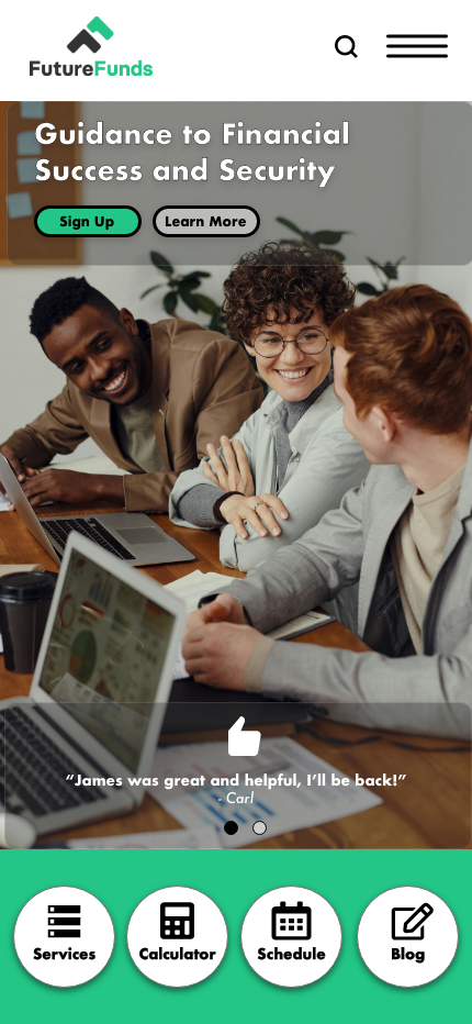
Original Wireframes Created by Junior Designer
Pictured above is the wireframe created by the junior designer that I was to improve. When looking at the user experience of the design wireframes, the user-centricity needs to be improved. Overall, here is a list I came up with that I felt could be updated:
- Call to action buttons should be included to help guide the user as needed
- The information/hierarchy should be reorganized to present itself as informative, trustworthy, and understandable for the user. The way the hierarchy is right now, the users could be confused as to what they would be scheduling for at the top of the page without having any information as to what the company is all about, which should be provided first in some way.
- Context should also be considered because the user may not be using a desktop browser to view the site, some may view through a mobile platform, which may alter the design in certain areas.
- Efficiency could be improved in order to prioritize the user’s experience with certain things changed in order to help the user’s experience flow with ease and make more sense. For example, more explanations and titles for areas such as the graph and the cards below “Who We Are” would also be beneficial.
- The cognitive load needs to be adjusted, the information presented all at once should be simplified, including the number of fields in the scheduling region as well as how many testimonials are presented on this page.

Competitive Research
An important step in this project was completing competitive research. I researched three competitors to the company FutureFunds which included Vanguard, Facet, and Wealthramp. I looked at how these companies offered, or did not offer, aspects such as a financial calculator, appointment schedulers, recent blog posts, testimonials, and service offerings. This allowed me to see how other companies are formatting their websites to gather insight into their functionality, flows, potential flaws and features. Understanding these insights helped me to develop strategies to improve FutureFunds wireframes.
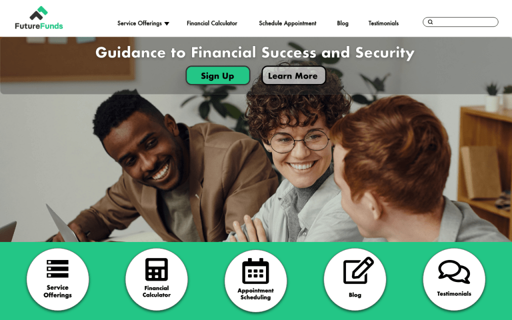
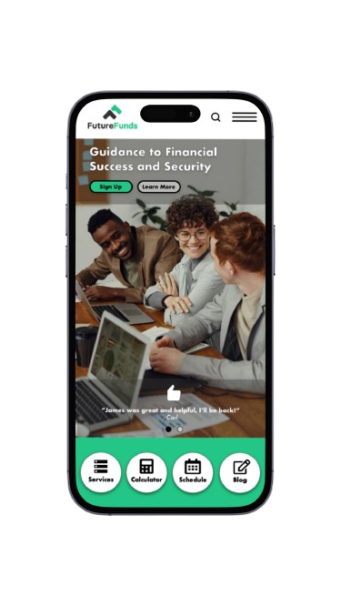
Pictured above are the updated desktop and mobile high fidelity wireframes that I redesigned. In order to make this design effective, I ensured to use the company colors and logo in an accessible way that makes it legible and readable for the users without too much information in one area. I also included spacing so users can understand which elements are categorized together, providing organization and a decluttered feel. I chose imagery that reflects young business professionals while considering diversity, capturing a warm and welcoming dynamic for the users. Drop shadows and overlays were provided to help enhance design elements such as buttons and headings.

User Testing Script
An important step in the design process is testing the design on a group of participants to identify any areas that could be improved as well as aspects that work well. For this project, the types of participants were the user personas that were included within the client brief. This included young professionals seeking financial planning services and education from a trusted service, FutureFunds. Below are the steps for getting started with the user testing process:
- In order to recruit these participants and encourage them to participate in the user testing, I would make a post to LinkedIn groups or Slack channels, or possibly consider a participant recruiter company. However, there have already been participants that have tested this prototype before with the previous designer, so I would consider reaching out to these users to return.
- Offer a screener questionnaire to consider in order to wean out those who would not necessarily qualify as our target user.
- When seeking to encourage the users participation, I would offer monetary compensation for their time.
- For testing, materials that I would need to have would be a facilitator guide and pen and paper to take notes. The facilitator guide will include the intro script for the beginning, a list of tasks that I will be giving as well as questions at different periods within the test, and a checklist for things that I personally would need to do as reminders (ask for consent, press record, etc).
Overall What I Learned…
This project taught me the importance of completing competitive research to better understand ways to improve my designs. It also taught me how necessary completing user testing is, and multiple times, within the design process to incorporate user feedback to improve the design even more ways. This encouraged me to think outside of myself and to put my perspective within others, approaching and viewing my designs in other ways.
The design I recreated helps to fix the user’s complaints by reducing the amount of information presented to the user, with clear navigational buttons that directs the user to the task they are seeking to complete both quickly and efficiently. I created and inserted a tagline to help represent the company and their intentions, giving the user a brief understanding of who this company is before anything else. This design provides the message of who the company is, how they would like to help the user, and a straight forward navigation to their offerings.
