Sustain-A-Look is a clothing company aiming to reduce environmental waste and combat unethical labor practices through providing their customers with eco-friendly, fair-trade, and high-quality clothing at a reasonable price. Sustain-A-Look had an original website that with reviews from users that expressed certain areas could be upgraded or changed.
My role in this project was to redesign Sustain-A-Look’s website to effectively communicate their brand mission, highlight the new donation and recycled clothing programs, and provide a smooth, accessible purchasing experience for their users. They wanted to add two new webpages, optimize the navigation based on those two new pages, streamline the copy for three other webpages, and ensure the website is accessible regarding the color contrast, readability and legibility. They are also requesting to create a seamless, accessible purchasing experience with design consistency across the website.
Various areas were found that needed changed, such as the space, cognitive overload, insufficient information architecture, inconsistency in brand identity, navigational issues, and lack of accessibility.
Design Journey
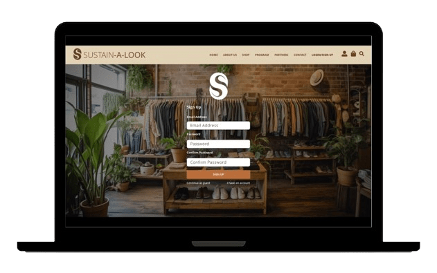
Original Prototype Wireframes
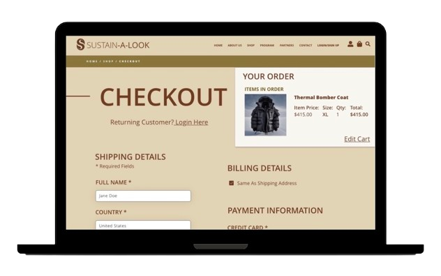
Pictured here is the original prototype for Sustain-A-Look’s website, specifically the product selection and check out pages.
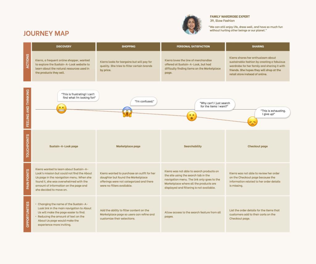
User Journey Map
After gathering research through user testing and their feedback, user journey maps were created to better understand the user’s experience and where they may be running into errors or frustrations. Upon summary of the user feedback, several appear to be experiencing difficulties when navigating back to the Marketplace page from the Checkout page as well as searching/filtering products on the Marketplace page. Some users experienced visual challenges and difficulties in reading some of the content. The Sustain-A-Look page contains a bit too much content and could be organized to not feel so overwhelming to the user.
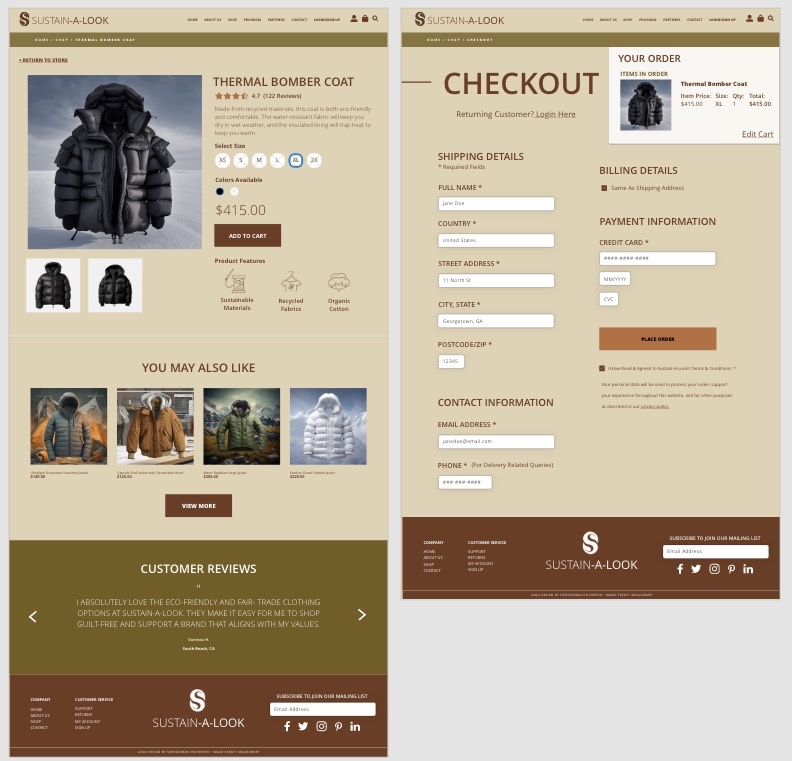
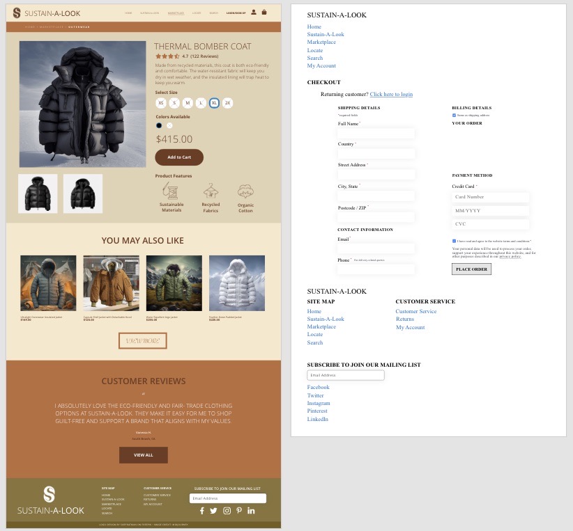
After reviewing the user feedback, I redesigned Sustain-A-Look’s product selection and checkout pages to address the errors and issues found. I included navigation from the Checkout back to the Marketplace page, provided the ability for users to review their orders before completing the checkout process, and included brand consistency across all pages.
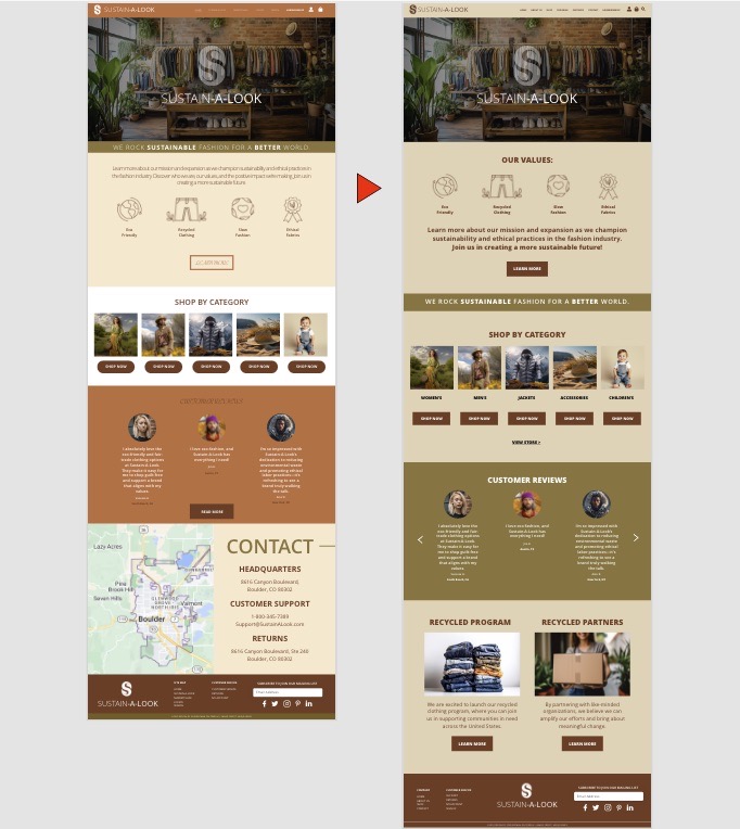
Home Page Wireframes Before and After
Pictured is the before (left) and after (right) of the Home page after making updates in Adobe XD. The colors were changed to provide brand consistency amongst all pages including the navigation, as well as confirmed through contrast checkers such as webaim.org to ensure readability for body copy, headers, footers and CTA buttons. The informational hierarchy amongst the page was organized and simplified to help the users find what they are looking for quicker and easier without cognitive overload, as well as highlight the two new pages that were added to the website: Recycled Program and Recycled Partners.
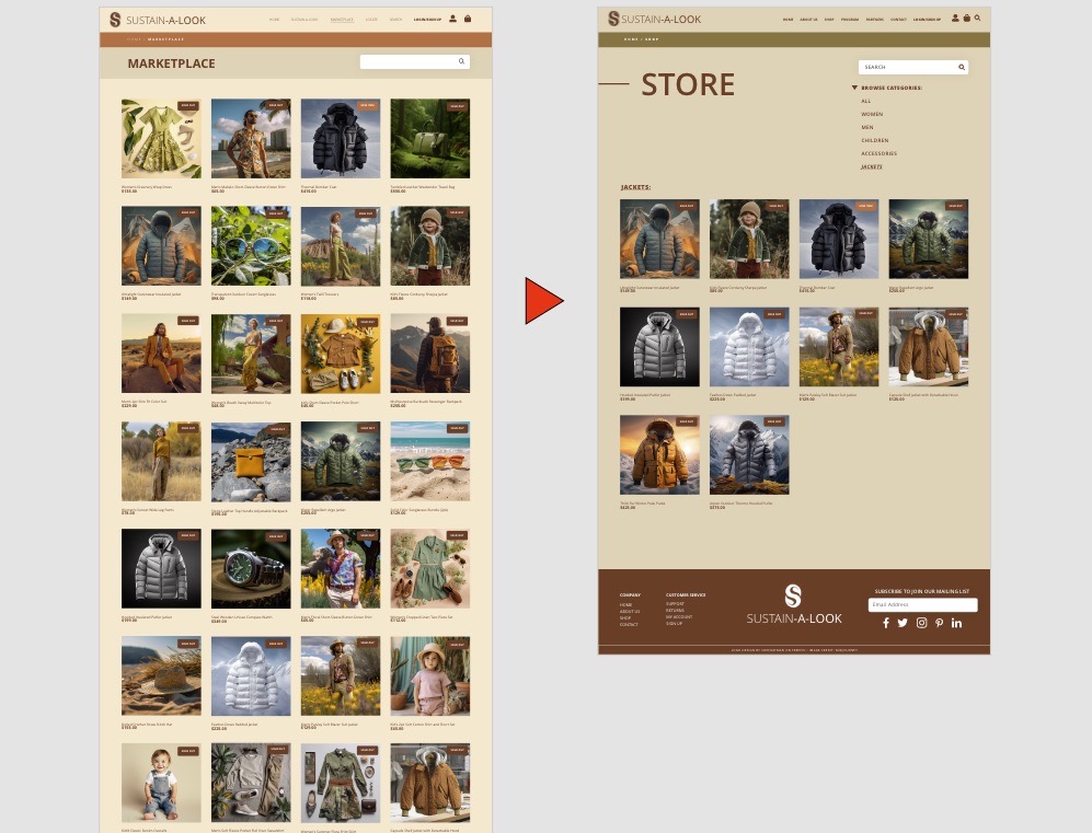
Store Page Wireframes Before and After
Pictured is the before (left) and after (right) of the Store page with changes made based on the user feedback as well accessible color choices approved through webAIM.org. Users found difficulty in searching for as well as filtering products on the store page, causing them to feel overwhelmed by the amount of information given. The products on the store page have been organized and condensed into categories with the ability for users to search for an item or select a filter to further narrow their options, speeding up their shopping process.
Overall What I Learned…
This project taught me the importance of completing user testing in order to better understand how effective, or ineffective, a design is toward a user. The feedback given by a user during their experience is important to address any errors or issues to better improve the experience by all. Information architecture was another value in this project, particularly in the store page, so that the users can find what they are looking for quickly and smoothly. Without categories, all of the products were listed on one page without any navigation which could make the search process for users much longer. Organization of each page, altering the colors and typography to improve accessibility, and addressing any errors helped to increase the overall functionality of this prototype.
